

一个可以折叠成图标的侧边栏。
侧边栏是最复杂的组件之一。它们是任何应用的核心,并且通常包含许多可移动部分。
🌐 Sidebars are one of the most complex components to build. They are central to any application and often contain a lot of moving parts.
我们现在有了一个坚实的基础可以在其上构建。可组合。可主题化。可自定义。
🌐 We now have a solid foundation to build on top of. Composable. Themeable. Customizable.
安装
🌐 Installation
结构
🌐 Structure
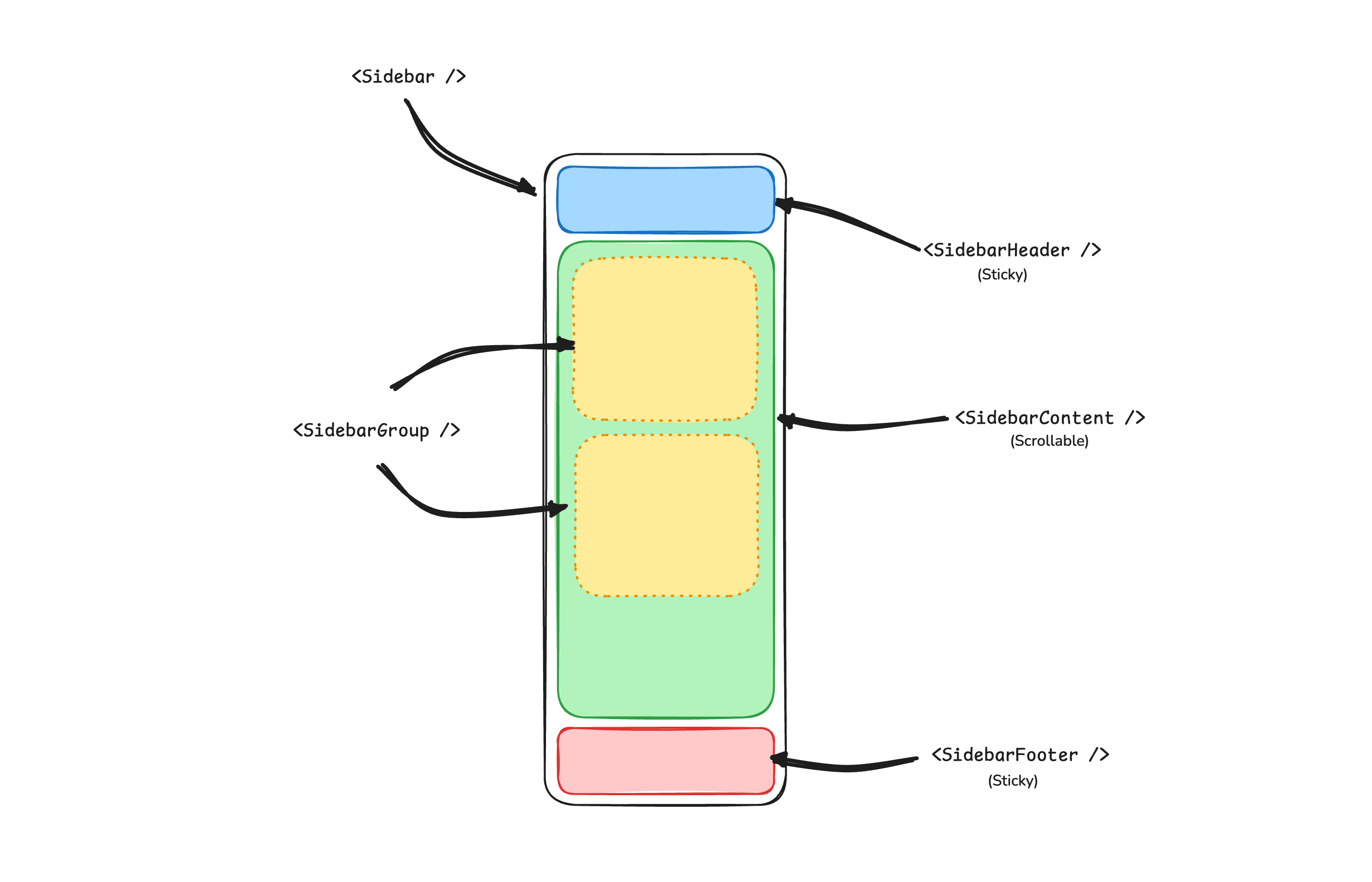
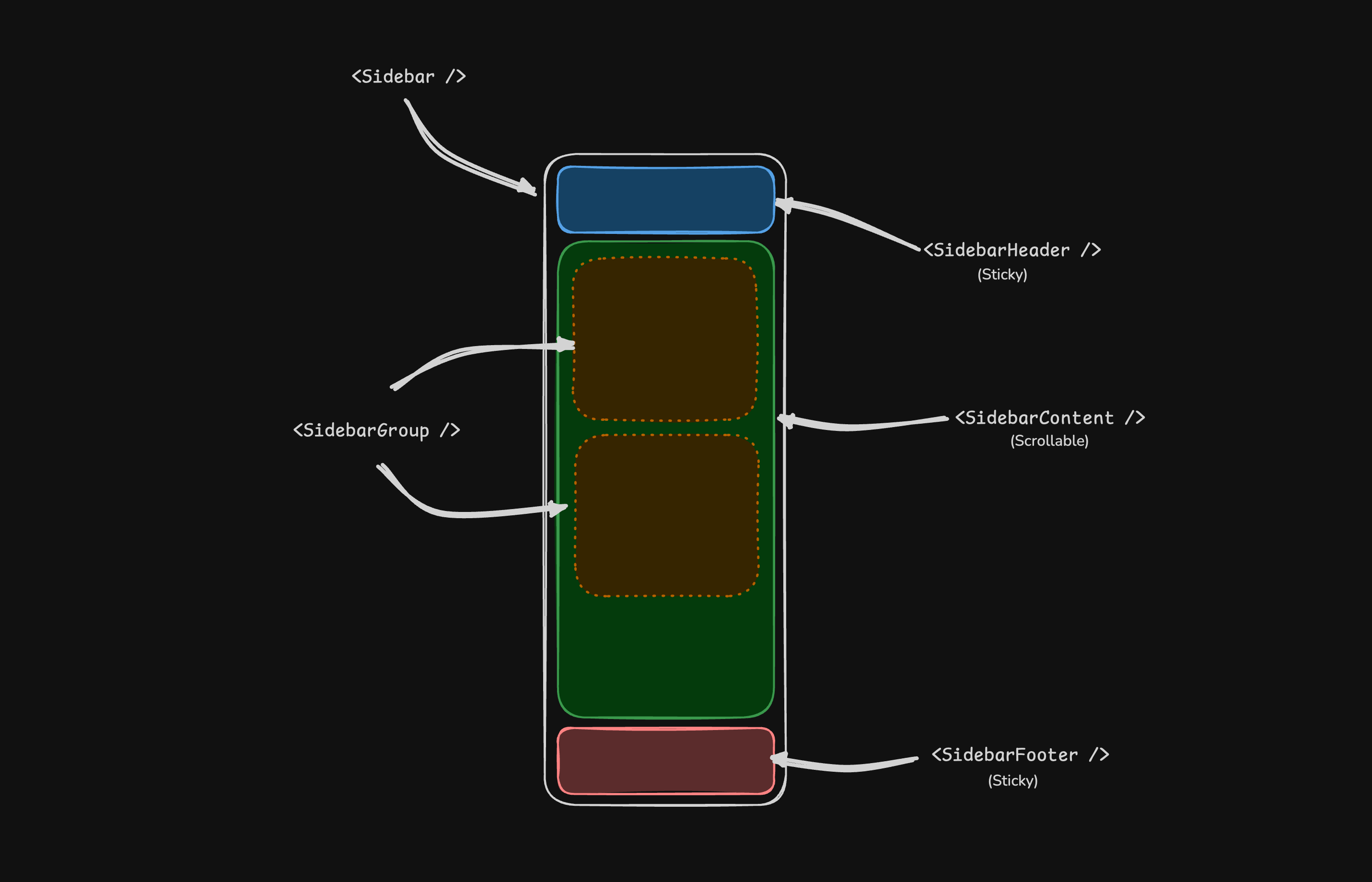
一个 Sidebar 组件由以下部分组成:
🌐 A Sidebar component is composed of the following parts:
SidebarProvider- 处理可折叠状态。Sidebar- 侧边栏容器。SidebarHeader和SidebarFooter- 粘贴在侧边栏的顶部和底部。SidebarContent- 可滚动内容。SidebarGroup-SidebarContent内的部分。SidebarTrigger-Sidebar的触发器。
用法
🌐 Usage
import { SidebarProvider, SidebarTrigger } from "@/components/ui/sidebar"
import { AppSidebar } from "@/components/app-sidebar"
export default function Layout({ children }: { children: React.ReactNode }) {
return (
<SidebarProvider>
<AppSidebar />
<main>
<SidebarTrigger />
{children}
</main>
</SidebarProvider>
)
}import {
Sidebar,
SidebarContent,
SidebarFooter,
SidebarGroup,
SidebarHeader,
} from "@/components/ui/sidebar"
export function AppSidebar() {
return (
<Sidebar>
<SidebarHeader />
<SidebarContent>
<SidebarGroup />
<SidebarGroup />
</SidebarContent>
<SidebarFooter />
</Sidebar>
)
}SidebarProvider
SidebarProvider 组件用于向 Sidebar 组件提供侧边栏上下文。你应该始终用 SidebarProvider 组件来封装你的应用。
🌐 The SidebarProvider component is used to provide the sidebar context to the Sidebar component. You should always wrap your application in a SidebarProvider component.
属性
🌐 Props
宽度
🌐 Width
如果你的应用中只有一个侧边栏,你可以在 sidebar.tsx 中使用 SIDEBAR_WIDTH 和 SIDEBAR_WIDTH_MOBILE 变量来设置侧边栏的宽度。
🌐 If you have a single sidebar in your application, you can use the SIDEBAR_WIDTH and SIDEBAR_WIDTH_MOBILE variables in sidebar.tsx to set the width of the sidebar.
const SIDEBAR_WIDTH = "16rem"
const SIDEBAR_WIDTH_MOBILE = "18rem"对于应用中的多个侧边栏,你可以在 style 属性中使用 --sidebar-width 和 --sidebar-width-mobile CSS 变量。
🌐 For multiple sidebars in your application, you can use the --sidebar-width and --sidebar-width-mobile CSS variables in the style prop.
<SidebarProvider
style={
{
"--sidebar-width": "20rem",
"--sidebar-width-mobile": "20rem",
} as React.CSSProperties
}
>
<Sidebar />
</SidebarProvider>键盘快捷方式
🌐 Keyboard Shortcut
要触发侧边栏,在 Mac 上使用 cmd+b 键盘快捷键,在 Windows 上使用 ctrl+b。
🌐 To trigger the sidebar, you use the cmd+b keyboard shortcut on Mac and ctrl+b on Windows.
const SIDEBAR_KEYBOARD_SHORTCUT = "b"侧边栏
🌐 Sidebar
用于渲染可折叠侧边栏的主要 Sidebar 组件。
🌐 The main Sidebar component used to render a collapsible sidebar.
属性
🌐 Props
注意: 如果你使用 inset 变体,请记得将主要内容封装在 SidebarInset 组件中。
<SidebarProvider>
<Sidebar variant="inset" />
<SidebarInset>
<main>{children}</main>
</SidebarInset>
</SidebarProvider>useSidebar
useSidebar 钩子用于控制侧边栏。
🌐 The useSidebar hook is used to control the sidebar.
import { useSidebar } from "@/components/ui/sidebar"
export function AppSidebar() {
const {
state,
open,
setOpen,
openMobile,
setOpenMobile,
isMobile,
toggleSidebar,
} = useSidebar()
}SidebarHeader
使用 SidebarHeader 组件向侧边栏添加固定头部。
🌐 Use the SidebarHeader component to add a sticky header to the sidebar.
<Sidebar>
<SidebarHeader>
<SidebarMenu>
<SidebarMenuItem>
<DropdownMenu>
<DropdownMenuTrigger asChild>
<SidebarMenuButton>
Select Workspace
<ChevronDown className="ml-auto" />
</SidebarMenuButton>
</DropdownMenuTrigger>
<DropdownMenuContent className="w-[--radix-popper-anchor-width]">
<DropdownMenuItem>
<span>Acme Inc</span>
</DropdownMenuItem>
</DropdownMenuContent>
</DropdownMenu>
</SidebarMenuItem>
</SidebarMenu>
</SidebarHeader>
</Sidebar>SidebarFooter
使用 SidebarFooter 组件向侧边栏添加固定底部。
🌐 Use the SidebarFooter component to add a sticky footer to the sidebar.
<Sidebar>
<SidebarFooter>
<SidebarMenu>
<SidebarMenuItem>
<SidebarMenuButton>
<User2 /> Username
</SidebarMenuButton>
</SidebarMenuItem>
</SidebarMenu>
</SidebarFooter>
</Sidebar>SidebarContent
SidebarContent 组件用于封装侧边栏的内容。在这里你可以添加你的 SidebarGroup 组件。它是可滚动的。
🌐 The SidebarContent component is used to wrap the content of the sidebar. This is where you add your SidebarGroup components. It is scrollable.
<Sidebar>
<SidebarContent>
<SidebarGroup />
<SidebarGroup />
</SidebarContent>
</Sidebar>SidebarGroup
使用 SidebarGroup 组件在侧边栏中创建一个部分。
🌐 Use the SidebarGroup component to create a section within the sidebar.
一个 SidebarGroup 有一个 SidebarGroupLabel、一个 SidebarGroupContent 和一个可选的 SidebarGroupAction。
🌐 A SidebarGroup has a SidebarGroupLabel, a SidebarGroupContent and an optional SidebarGroupAction.
<SidebarGroup>
<SidebarGroupLabel>Application</SidebarGroupLabel>
<SidebarGroupAction>
<Plus /> <span className="sr-only">Add Project</span>
</SidebarGroupAction>
<SidebarGroupContent></SidebarGroupContent>
</SidebarGroup>要使 SidebarGroup 可折叠,请将其封装在 Collapsible 中。
🌐 To make a SidebarGroup collapsible, wrap it in a Collapsible.
<Collapsible defaultOpen className="group/collapsible">
<SidebarGroup>
<SidebarGroupLabel asChild>
<CollapsibleTrigger>
Help
<ChevronDown className="ml-auto transition-transform group-data-[state=open]/collapsible:rotate-180" />
</CollapsibleTrigger>
</SidebarGroupLabel>
<CollapsibleContent>
<SidebarGroupContent />
</CollapsibleContent>
</SidebarGroup>
</Collapsible>SidebarMenu
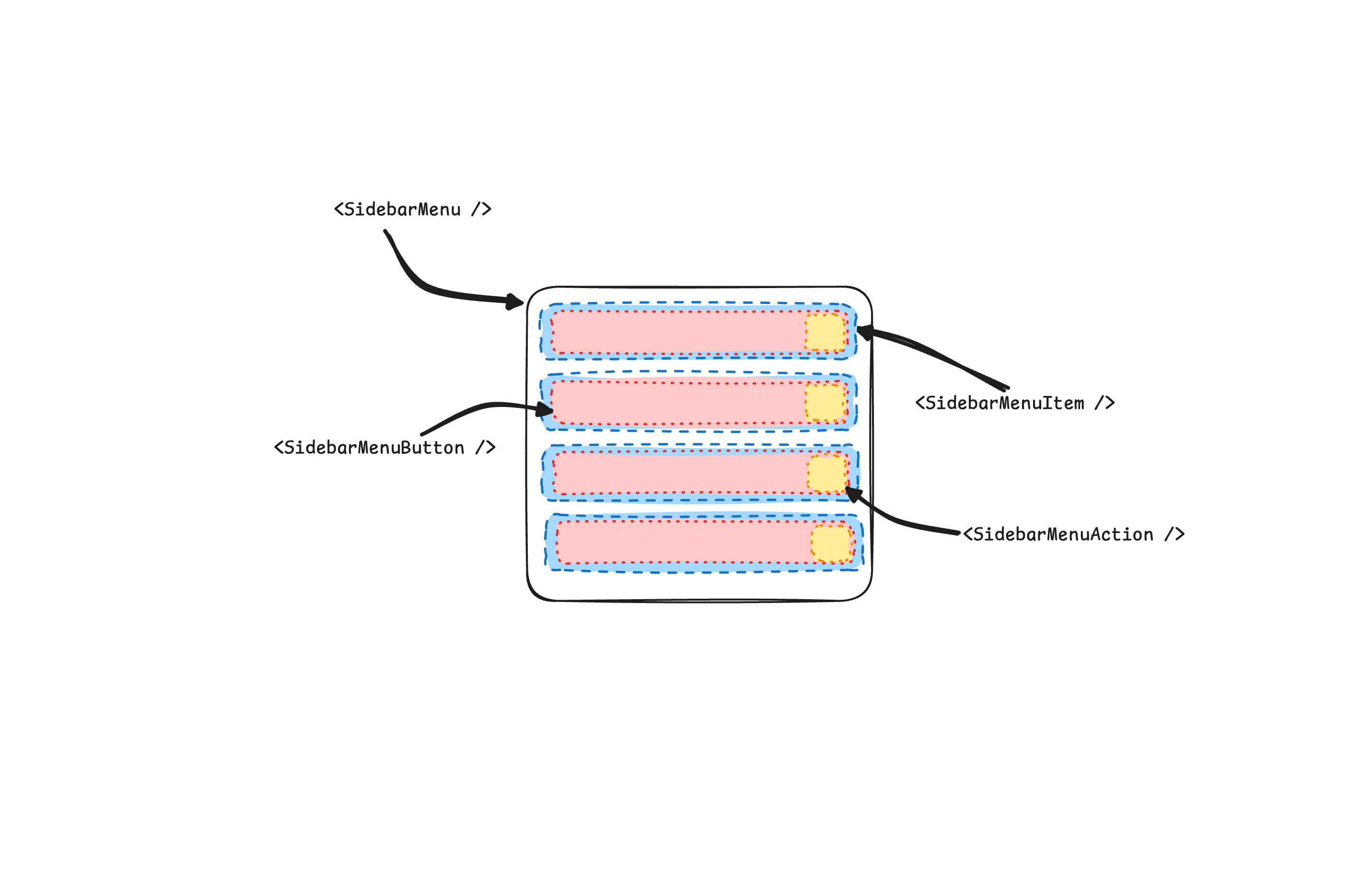
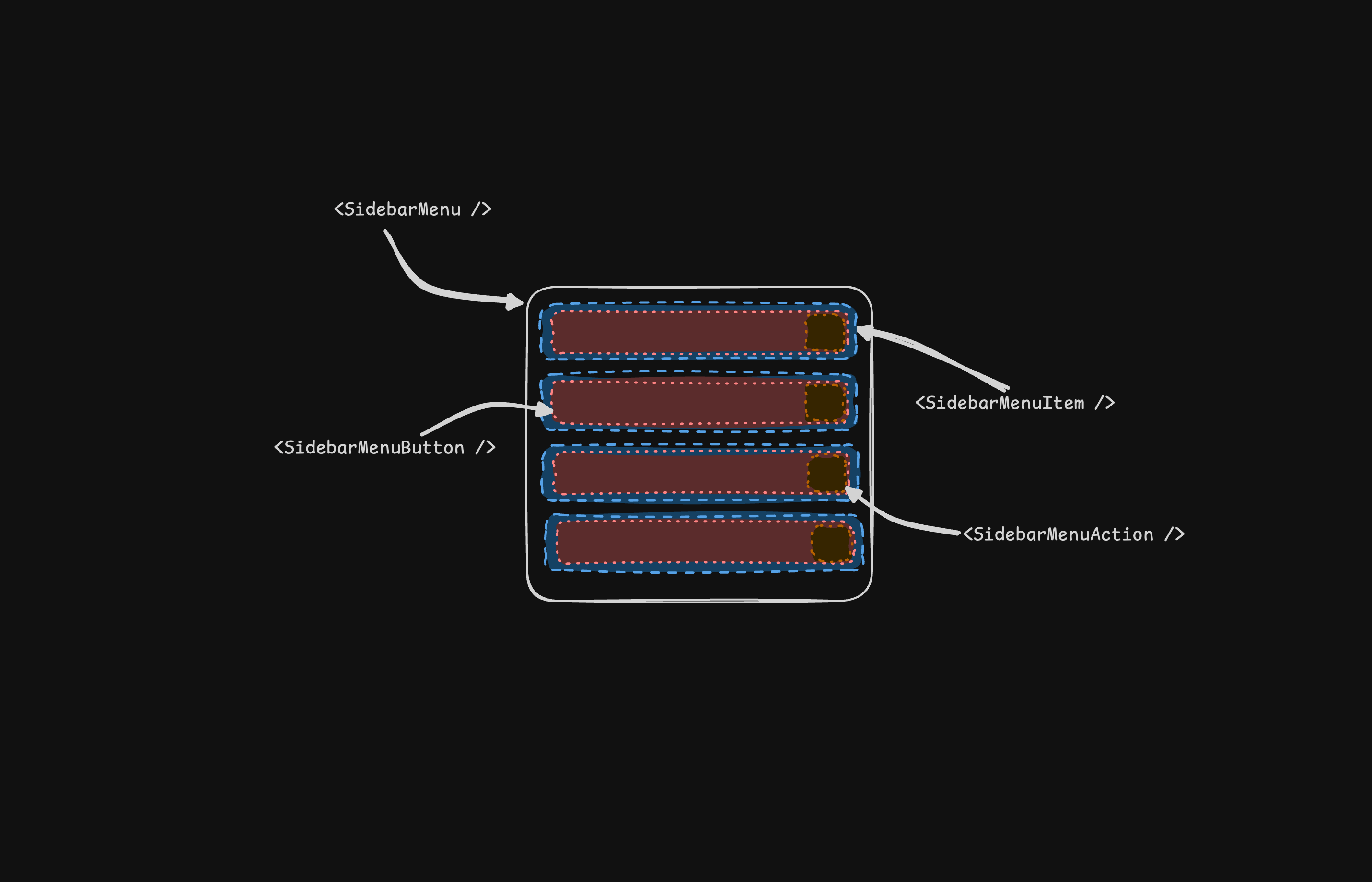
SidebarMenu 组件用于在 SidebarGroup 中构建菜单。
🌐 The SidebarMenu component is used for building a menu within a SidebarGroup.
<SidebarMenu>
{projects.map((project) => (
<SidebarMenuItem key={project.name}>
<SidebarMenuButton asChild>
<a href={project.url}>
<project.icon />
<span>{project.name}</span>
</a>
</SidebarMenuButton>
</SidebarMenuItem>
))}
</SidebarMenu>SidebarMenuButton
SidebarMenuButton 组件用于在 SidebarMenuItem 中渲染一个菜单按钮。
🌐 The SidebarMenuButton component is used to render a menu button within a SidebarMenuItem.
默认情况下,SidebarMenuButton 会渲染一个按钮,但你可以使用 asChild 属性来渲染不同的组件,例如 Link 或 a 标签。
🌐 By default, the SidebarMenuButton renders a button but you can use the asChild prop to render a different component such as a Link or an a tag.
使用 isActive 属性将菜单项标记为活动状态。
🌐 Use the isActive prop to mark a menu item as active.
<SidebarMenuButton asChild isActive>
<a href="#">Home</a>
</SidebarMenuButton>SidebarMenuAction
SidebarMenuAction 组件用于在 SidebarMenuItem 中呈现菜单操作。
🌐 The SidebarMenuAction component is used to render a menu action within a SidebarMenuItem.
<SidebarMenuItem>
<SidebarMenuButton asChild>
<a href="#">
<Home />
<span>Home</span>
</a>
</SidebarMenuButton>
<SidebarMenuAction>
<Plus /> <span className="sr-only">Add Project</span>
</SidebarMenuAction>
</SidebarMenuItem>SidebarMenuSub
SidebarMenuSub 组件用于在 SidebarMenu 中渲染子菜单。
🌐 The SidebarMenuSub component is used to render a submenu within a SidebarMenu.
<SidebarMenuItem>
<SidebarMenuButton />
<SidebarMenuSub>
<SidebarMenuSubItem>
<SidebarMenuSubButton />
</SidebarMenuSubItem>
</SidebarMenuSub>
</SidebarMenuItem>SidebarMenuBadge
SidebarMenuBadge 组件用于在 SidebarMenuItem 中渲染徽章。
🌐 The SidebarMenuBadge component is used to render a badge within a SidebarMenuItem.
<SidebarMenuItem>
<SidebarMenuButton />
<SidebarMenuBadge>24</SidebarMenuBadge>
</SidebarMenuItem>SidebarMenuSkeleton
SidebarMenuSkeleton 组件用于为 SidebarMenu 渲染骨架。
🌐 The SidebarMenuSkeleton component is used to render a skeleton for a SidebarMenu.
<SidebarMenu>
{Array.from({ length: 5 }).map((_, index) => (
<SidebarMenuItem key={index}>
<SidebarMenuSkeleton />
</SidebarMenuItem>
))}
</SidebarMenu>SidebarTrigger
使用 SidebarTrigger 组件来渲染一个切换侧边栏的按钮。
🌐 Use the SidebarTrigger component to render a button that toggles the sidebar.
import { useSidebar } from "@/components/ui/sidebar"
export function CustomTrigger() {
const { toggleSidebar } = useSidebar()
return <button onClick={toggleSidebar}>Toggle Sidebar</button>
}SidebarRail
SidebarRail 组件用于在 Sidebar 中渲染一个轨道。该轨道可用于切换侧边栏。
🌐 The SidebarRail component is used to render a rail within a Sidebar. This rail can be used to toggle the sidebar.
<Sidebar>
<SidebarHeader />
<SidebarContent>
<SidebarGroup />
</SidebarContent>
<SidebarFooter />
<SidebarRail />
</Sidebar>受控侧边栏
🌐 Controlled Sidebar
使用 open 和 onOpenChange 属性来控制侧边栏。
🌐 Use the open and onOpenChange props to control the sidebar.
export function AppSidebar() {
const [open, setOpen] = React.useState(false)
return (
<SidebarProvider open={open} onOpenChange={setOpen}>
<Sidebar />
</SidebarProvider>
)
}主题
🌐 Theming
我们使用以下 CSS 变量来设置侧边栏的主题。
🌐 We use the following CSS variables to theme the sidebar.
@layer base {
:root {
--sidebar-background: 0 0% 98%;
--sidebar-foreground: 240 5.3% 26.1%;
--sidebar-primary: 240 5.9% 10%;
--sidebar-primary-foreground: 0 0% 98%;
--sidebar-accent: 240 4.8% 95.9%;
--sidebar-accent-foreground: 240 5.9% 10%;
--sidebar-border: 220 13% 91%;
--sidebar-ring: 217.2 91.2% 59.8%;
}
.dark {
--sidebar-background: 240 5.9% 10%;
--sidebar-foreground: 240 4.8% 95.9%;
--sidebar-primary: 0 0% 98%;
--sidebar-primary-foreground: 240 5.9% 10%;
--sidebar-accent: 240 3.7% 15.9%;
--sidebar-accent-foreground: 240 4.8% 95.9%;
--sidebar-border: 240 3.7% 15.9%;
--sidebar-ring: 217.2 91.2% 59.8%;
}
}样式
🌐 Styling
以下是根据不同状态设置侧边栏样式的一些技巧。
🌐 Here are some tips for styling the sidebar based on different states.
<Sidebar collapsible="icon">
<SidebarContent>
<SidebarGroup className="group-data-[collapsible=icon]:hidden" />
</SidebarContent>
</Sidebar><SidebarMenuItem>
<SidebarMenuButton />
<SidebarMenuAction className="peer-data-[active=true]/menu-button:opacity-100" />
</SidebarMenuItem>从右到左
🌐 RTL
要在 shadcn/ui 中启用 RTL 支持,请参阅 RTL 配置指南。
🌐 To enable RTL support in shadcn/ui, see the RTL configuration guide.
View RTL Sidebar更新日志
🌐 Changelog
右到左支持
🌐 RTL Support
如果你正在从之前版本的 Sidebar 组件升级,你需要应用以下更新以添加 RTL 支持:
🌐 If you're upgrading from a previous version of the Sidebar component, you'll need to apply the following updates to add RTL support:
向侧边栏组件添加 dir 属性。
将 dir 添加到解构的 props 中,并将其传递给移动端的 SheetContent:
🌐 Add dir to the destructured props and pass it to SheetContent for mobile:
function Sidebar({
side = "left",
variant = "sidebar",
collapsible = "offcanvas",
className,
children,
+ dir,
...props
}: React.ComponentProps<"div"> & {
side?: "left" | "right"
variant?: "sidebar" | "floating" | "inset"
collapsible?: "offcanvas" | "icon" | "none"
}) {然后在移动视图中将其传递给 SheetContent:
🌐 Then pass it to SheetContent in the mobile view:
<Sheet open={openMobile} onOpenChange={setOpenMobile} {...props}>
<SheetContent
+ dir={dir}
data-sidebar="sidebar"
data-slot="sidebar"
data-mobile="true"向侧边栏容器添加 data-side 属性。
将 data-side={side} 添加到侧边栏容器元素中:
🌐 Add data-side={side} to the sidebar container element:
<div
data-slot="sidebar-container"
+ data-side={side}
className={cn(更新侧边栏容器定位类。
将 JavaScript 三元条件类替换为 CSS 数据属性选择器:
🌐 Replace JavaScript ternary conditional classes with CSS data attribute selectors:
className={cn(
- "fixed inset-y-0 z-10 hidden h-svh w-(--sidebar-width) transition-[left,right,width] duration-200 ease-linear md:flex",
- side === "left"
- ? "left-0 group-data-[collapsible=offcanvas]:left-[calc(var(--sidebar-width)*-1)]"
- : "right-0 group-data-[collapsible=offcanvas]:right-[calc(var(--sidebar-width)*-1)]",
+ "fixed inset-y-0 z-10 hidden h-svh w-(--sidebar-width) transition-[left,right,width] duration-200 ease-linear md:flex data-[side=left]:left-0 data-[side=right]:right-0 data-[side=left]:group-data-[collapsible=offcanvas]:left-[calc(var(--sidebar-width)*-1)] data-[side=right]:group-data-[collapsible=offcanvas]:right-[calc(var(--sidebar-width)*-1)]",更新 SidebarRail 定位类。
更新 SidebarRail 组件以使用物理定位来设置导轨:
🌐 Update the SidebarRail component to use physical positioning for the rail:
className={cn(
- "hover:after:bg-sidebar-border absolute inset-y-0 z-20 hidden w-4 -translate-x-1/2 transition-all ease-linear group-data-[side=left]:-end-4 group-data-[side=right]:start-0 after:absolute after:inset-y-0 after:start-1/2 after:w-[2px] sm:flex",
+ "hover:after:bg-sidebar-border absolute inset-y-0 z-20 hidden w-4 ltr:-translate-x-1/2 rtl:-translate-x-1/2 transition-all ease-linear group-data-[side=left]:-right-4 group-data-[side=right]:left-0 after:absolute after:inset-y-0 after:start-1/2 after:w-[2px] sm:flex",为 SidebarTrigger 图标添加 RTL 翻转。
在 SidebarTrigger 中的图标上添加 className="rtl:rotate-180" 以在 RTL 模式下翻转它:
🌐 Add className="rtl:rotate-180" to the icon in SidebarTrigger to flip it in RTL mode:
<Button ...>
- <PanelLeftIcon />
+ <PanelLeftIcon className="rtl:rotate-180" />
<span className="sr-only">Toggle Sidebar</span>
</Button>应用这些更改后,你可以使用 dir 属性来设置方向:
🌐 After applying these changes, you can use the dir prop to set the direction:
<Sidebar dir="rtl" side="right">
</Sidebar>侧边栏将在 LTR 和 RTL 布局中正确定位并处理交互。
🌐 The sidebar will correctly position itself and handle interactions in both LTR and RTL layouts.